Discount Dance Supply
Industry: E-Commerce
Responsibility: Information architecture


Overview
A dance supply site that aims to provide high quality, well-established brands at competitive prices. Discount Dance Supply has a wide selection of product offerings for students, parents, teachers, and studios. They also have a dance lifestyle feed that links to social media.
Business Goals
Increase conversion rate and lower abandonment rate.
Increase loyalty and build customer base.
Redesign Goals
Restructure categories to decrease cognitive load and increase findability of product.
Improve mobile experience and navigation.
Create appropriate hierarchy to help guide users and increase retention.

User Groups
01: Intermediate- to Advanced-level dancers & their parents
02: Gymnasts and their parents, dance teachers, dance studios & teams
Current Site Map

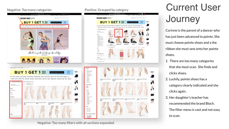
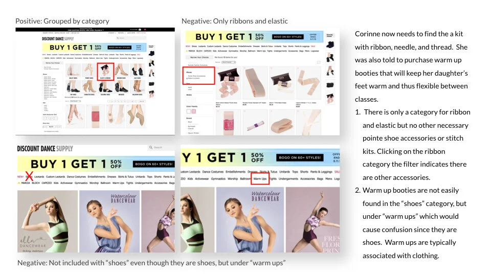
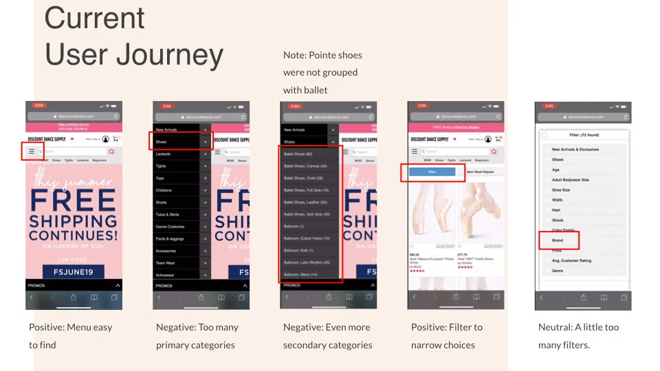
There are too many product categories at the primary level requiring the customer to read through all the categories listed consequently increasing cognitive load, which can cause confusion. Many products can be found in multiple categories. Items spread across multiple categories pose challenges for the customer, making navigation more difficult and decreasing usability.
Proposed Site Map

Reduction in the number of primary categories by creating secondary and tertiary categories. The categories take the user down a path that helps filter as they journey towards their end goal.

SaaS for a HR Provider
Industry: B2B - Human Resources Software provider
Responsibility: UX research
Team: 4 researchers

Project Goals
Identify pain points in current version of the payroll batch software, which we will call PayBatch
Evaluate and make recommendations on functionality
Assess initial response and feedback from users on PayBatch 2.0, specifically around navigation and understanding of the new design
Scope Of Test
Review the SuperBatch 2.0 prototype for the following:
Overall aesthetics and navigation within PayBatch 2.0
Visual display of important information within PayBatch 2.0
Refining of critical data by a range of categories
Identification, categorization, and prioritization of problems
List of prioritized recommendations based on findings
Project Methodology

Team Assessment of Findings


Primary User: Payroll Specialist
Works for Professional Employer Organization (PEO) / Service Provider
•
Processes payroll weekly for a high volume of small to medium sized business clients assigned to them
•
Can be in the system for hours at a time


Test Session Logistics
60 min. recorded sessions
Participants were compensated with an e-gift card
Each moderator had a notetaker either present during test sessions or assessed the recording post-session
Employed “think aloud” protocol while users completed 1 open ended task and 6 additional tasks
Test Findings


Summary of Positive Findings
Aesthetics
Visually appeal interface
Like the look of larger icons
More in-depth client info on page
Automation / Customizability
Drop down menus and filter provide customizability
Batch processing functionality is a helpful new feature
Clarity / Feedback
At-a-glance overview of all clients
New pending approval functionality informative
Information about the locked timesheet and ability to unlock it is key
Navigation
Menu for various functions and notes function within program, rather than having to leave PayBatch for access increases efficiency

“It looks pretty cool!”
The old PayBatch condensed a lot of information into a tight space. The 2.0 version used negative space for increased scannability and various grouping principles to create a hierarchy of information.
(Please note, due to NDA screens have filters to obscure identifying information.)
Summary of Severe Findings
Navigation
Trouble locating where to launch Client Details
Clarity / Feedback
Unclear of meaning and functionality of icons and color codes

Hover Over Text and Color Change
By adding hover over text with explanations of where the link goes to, you can eliminate uncertainty and prevent users from making errors in processing their payroll clients.
Light blue text can be difficult for users to read especially if they have impaired vision or are fatigued. Color scheme in general could be challenging for color blind users.
Summary of Minor Problems
Aesthetics
Overall page looks busy and cluttered
Big icons unnecessary, some found it redundant
Light blue text color can be challenging to read
Automation / Customizability
Filters placed too high on the page
Clarity / Feedback
Notification of read/unread Payroll Notes
The capacity of “Batch Functions” are unclear
Navigation
Unclear navigation for accessing payroll control

“It would be nice instead of having to go to the heading if I could sort by any column heading.”
Being able to sort by clicking the column headers was mentioned by more than one participant as something they would like to be able to do.

Radio buttons v. Checkboxes
Recommend squares here instead of circles.
Participants didn’t realize you can select more than one client by clicking within these circles. Radio buttons typically indicate only one choice could be made. Previous mental model could be interfering with the functionality of this feature.
Summary of Recommendations
🚩 High priority
Add “hover over text” for links to explain where they navigate to
Add “hover over text” to all buttons/icons in the interface so users know what the different statuses mean and what action they can take
🔶 medium priority
Change the text color for Client name and Payroll number to darker color for more contrast.
Provide user the option to hide or lock the row of icons
Allow users the option ti hide certain icons/actions that are not applicable to them to help avoid processing errors
Add feedback to show if Payroll Notes are new/unread or have been read
Change icon for bath editing next to a client name from circle to square (to better indicate that user can multiselect)
Add confirmation pop-up when user select any of the batch functionality
🟡 low priority
Move filters down to the column of headers as users expected to see that option there before discovering the filters at the top of the page
Add navigation to Client Details application from the kebab menu
Add the ability to edit cutoff dates from SuperBatch so users don’t have to go to Payroll Control to do this